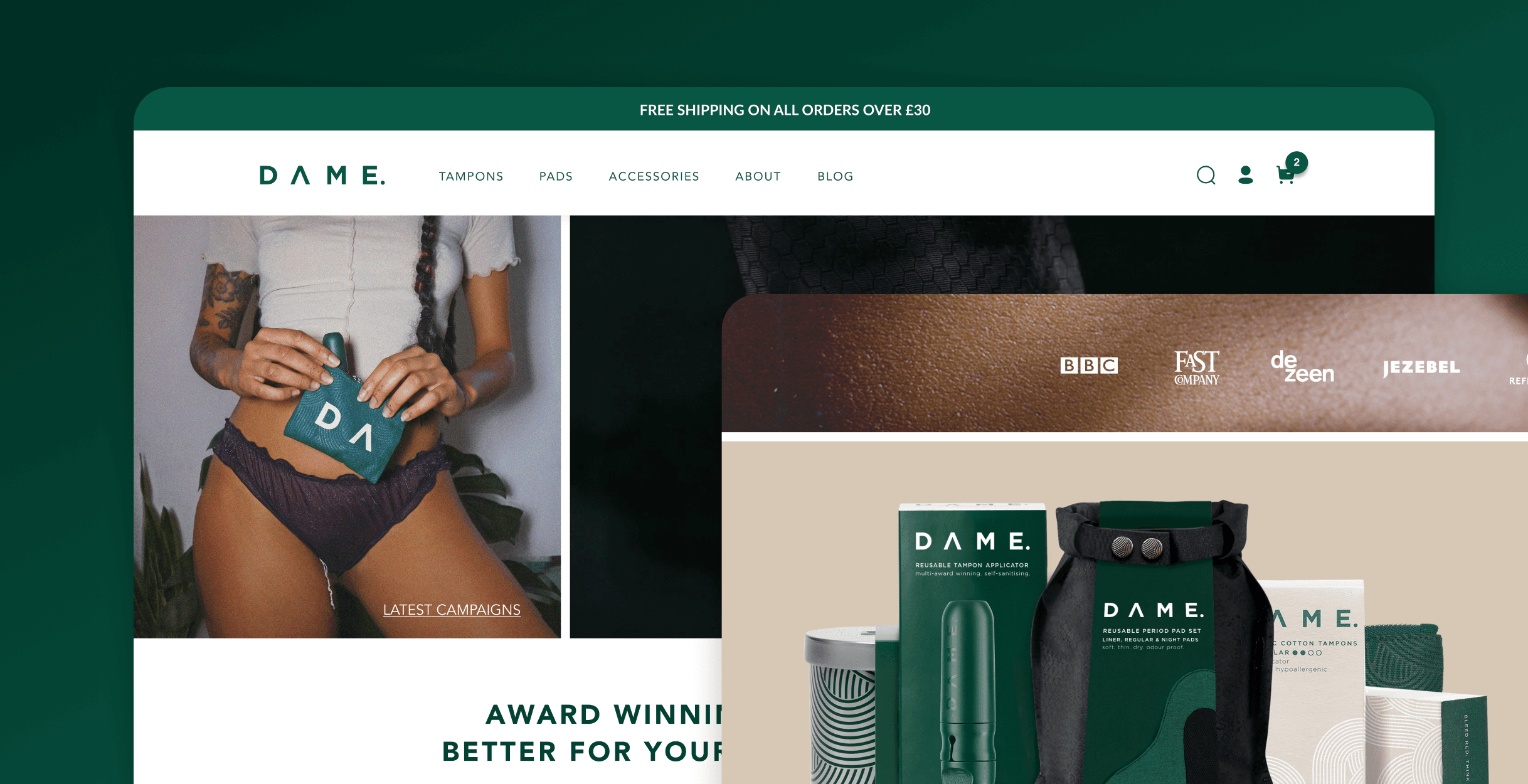
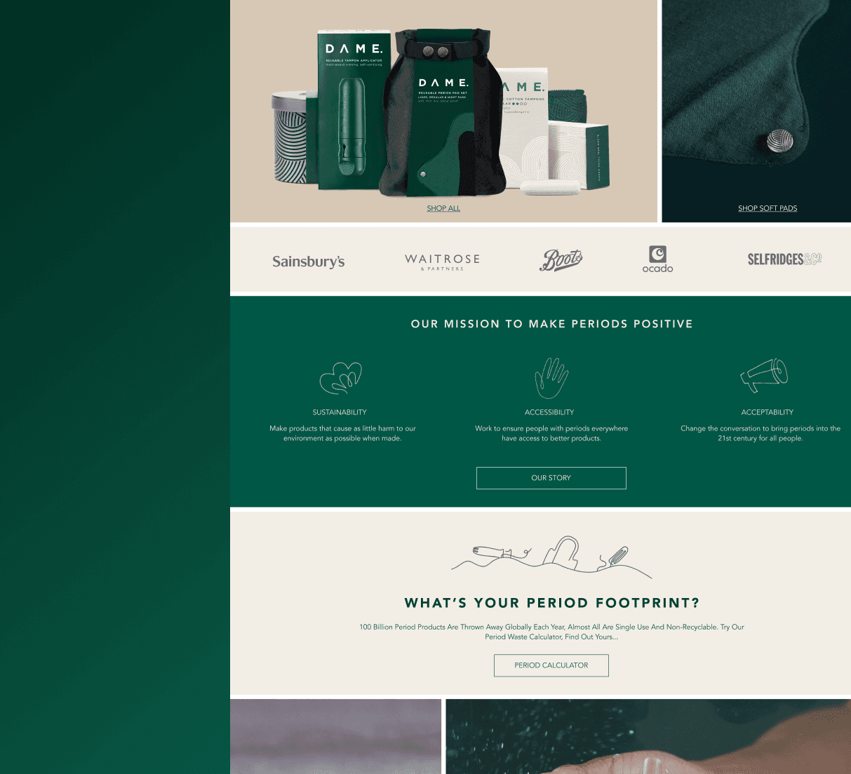
As the sole UX/UI Designer working on this project, I helped refresh the website with a playful, "cork board" collage style that matched the brand’s sustainable ethos. The design mixed lifestyle photos and textures, giving the site a warm, approachable feel while keeping a minimalistic and clean look. By refining product displays and emphasising subscription options, we encouraged customers to explore product combinations, boosting the average basket size while keeping the experience intuitive.
01
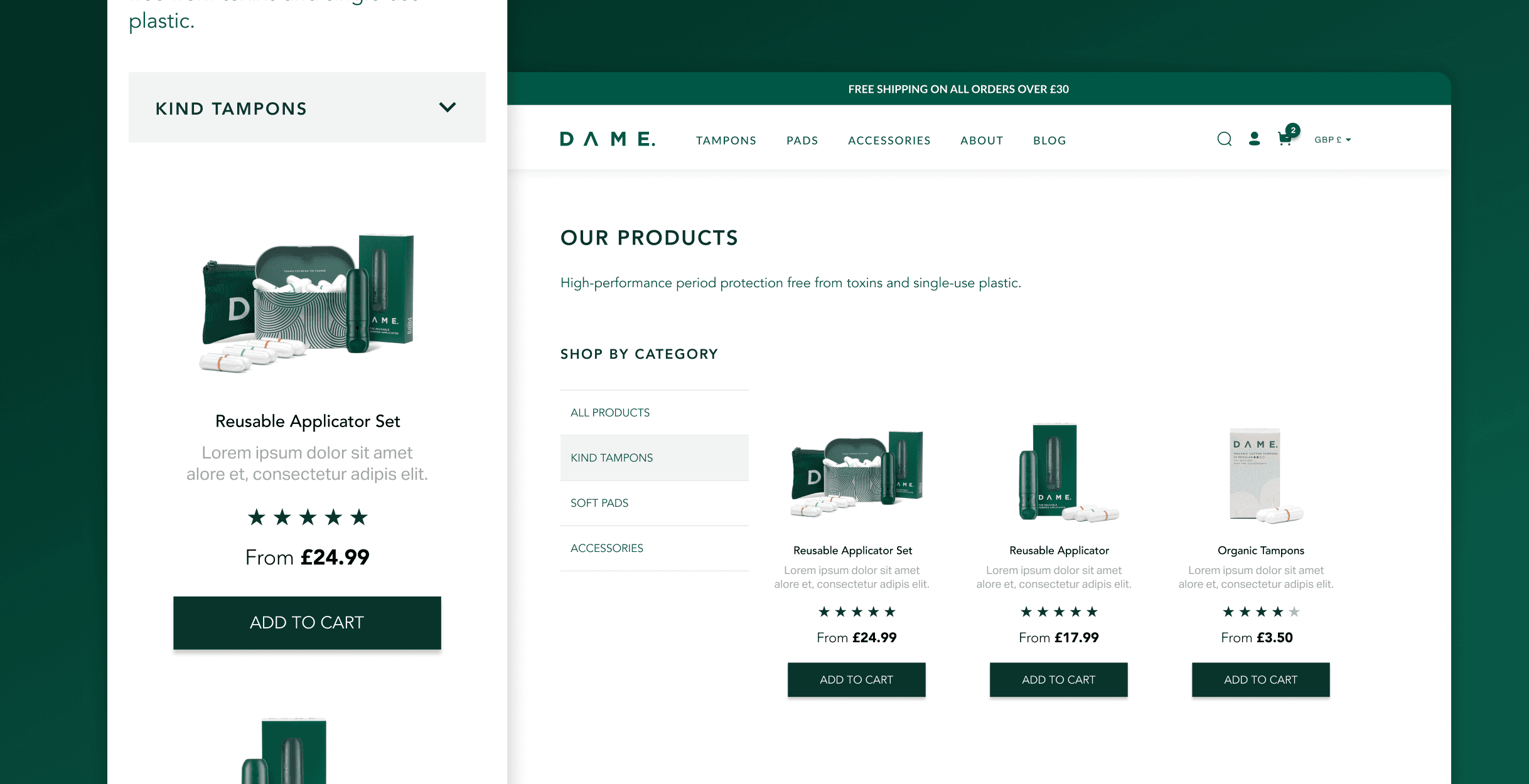
The problem with the subscription model for organic tampons was that the purchasing process was not designed for recurrent purchases or cross-selling. Customers faced an interface that made it difficult to navigate options and manage their subscriptions. This lack of optimisation led to lower engagement and deterred users from committing to regular purchases.
02
Given the goal was to improve conversions, recurrent orders and create a sense of community, the focus was on prioritising sections with products and make the USP prominent, adding a categories page and improving the cross-selling and subscription options on the product pages.

03
Concept
The concept was all about understanding how Dame’s audience (women who have their period, ranging from young adults to those in their 40s) interacted with the site and turning those insights into a better experience. We wanted the site to truly connect with Dame’s community and encourage them to take action. Inspired by the look of photo collages, the focus was on using striking visuals and creative design to tell Dame’s story in a way that felt authentic and resonated with this audience.
04
Goals
Given the main products are the reusable applicator and the organic tampons, the goal was to cross-sell these two and prompt users to subscribe to the organic tampons, the upsell to the set was equally important.
05
Categories page
The categories page was designed with a forward-thinking approach, keeping in mind Dame’s plans to expand their products range. I made sure the layout was flexible, allowing the brand to easily introduce new products as they grew while making sure it didn't look weird with few products only. The design not only provided a clean way for users to browse current offerings but also ensured that future additions could be seamlessly integrated without disruption.

06
Navbar dropdown
The dropdown in the navigation bar was designed to help users quickly access products from any page of the website.


07
Improving order value
To help increase order value on the organic tampon product page, we made sure the subscription option was selected by default, while still clearly displaying the other purchase options. This encouraged users to consider the subscription but allowed flexibility for one-time purchases. We also included a subtle cross-sell for the tampon applicator on the same page, below the fold, making it easy for users to add it to their basket with just a click.

08
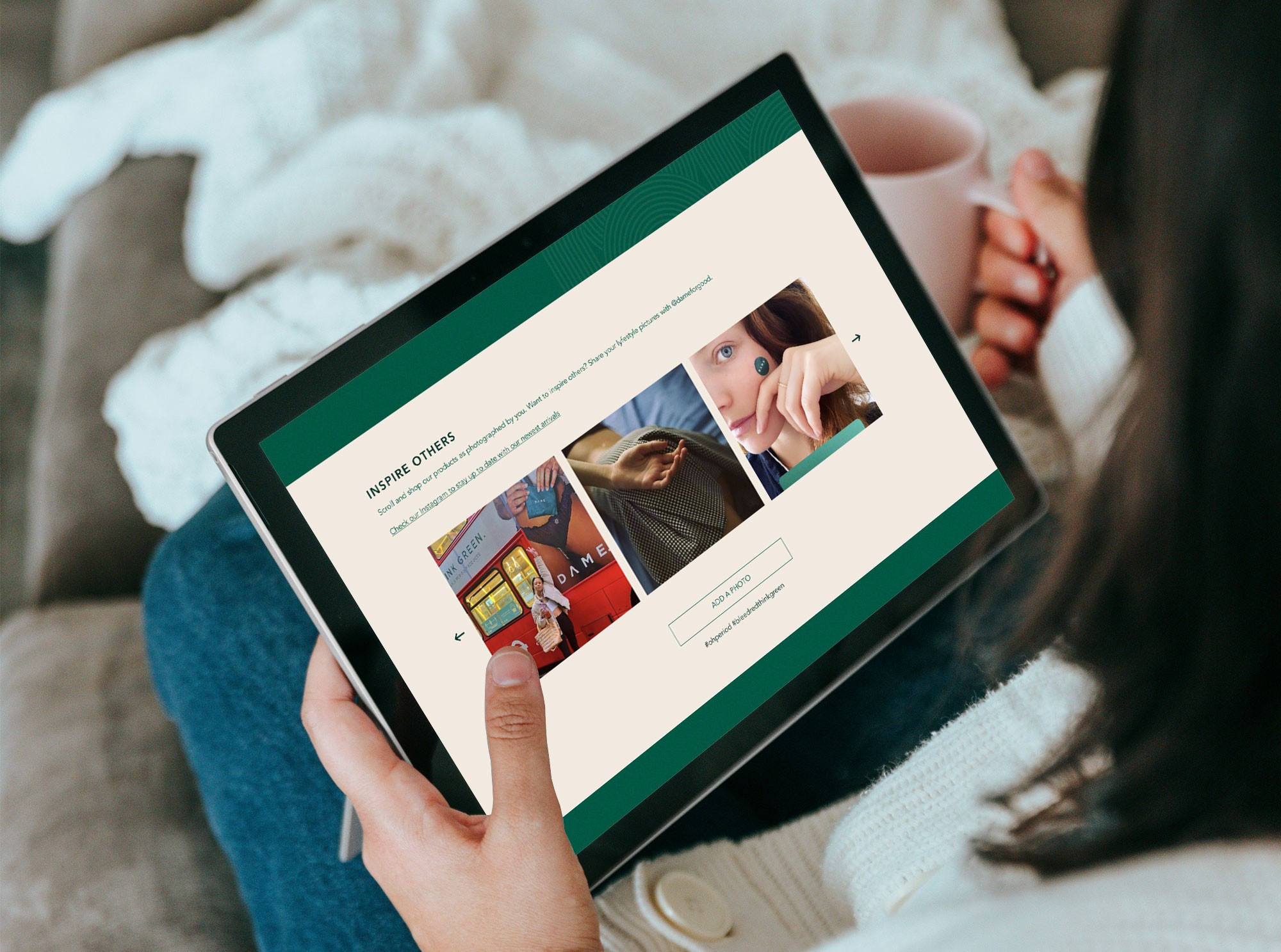
Creating a sense of community
Aimed to foster a welcoming space where users could connect with the brand, read related stories and posts on the blog, and embrace sustainability, while maintaining an 'hipster' vibe.

09
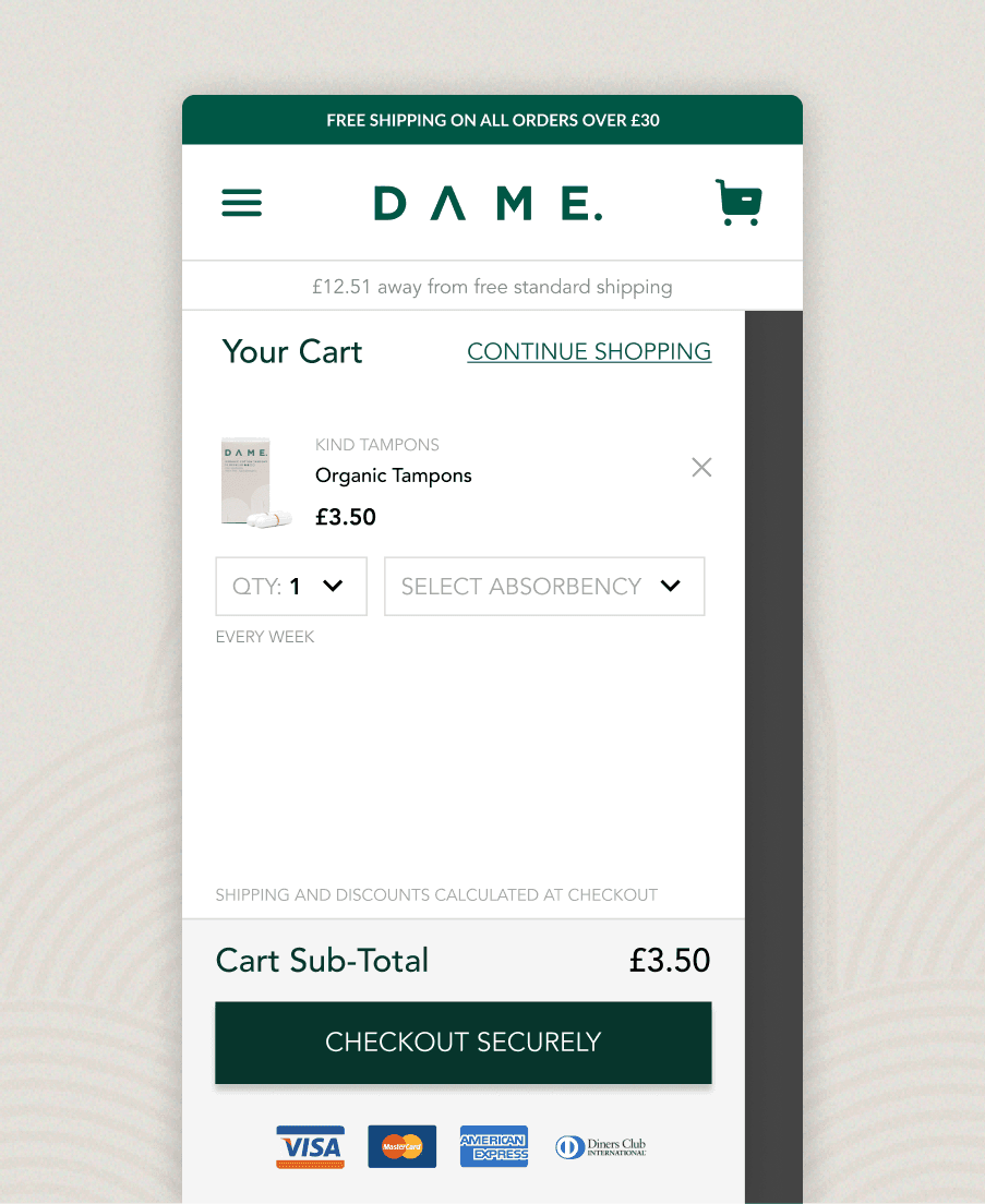
Mini-cart
The mini cart offers a quick view to all the products the user has on their cart, also allowing them to change quantities and other options and check if the product added is a subscription or not.

10
Blog
The blog was designed to be a warm and inviting space that reflected Dame's style. We chose pastel colours reminiscent of cork and old paper, creating a cosy vibe like a collage board. This approach made the blog feel familiar and approachable for readers. By sharing helpful content about periods and sustainability, we aimed to engage visitors and encourage them to dive deeper into these topics.

